Today, two questions for you to ponder:
- To emphasize something (an idea, a word, an image, a sensation, anything), should you add or remove?
- To make something more beautiful, do you need to add or remove?
So this is a post about adding and removing.
I come at this, naturally, from the perspective of a writer. And as you might remember from my post about “color in writing,” I like to use art as an analogy for writing. Of course, I could also use sound, or smell, or touch or taste — but that is harder to do on a blog. So let’s think about words as visual stimuli.
I. Zen writing or Thai writing
Look at those two temple scenes above (both from Wikipedia). I’ve been to both temples. Both are Buddhist. One is in Kyoto, Japan, the other in Chiang Mai, Thailand. Both cities are among the most beautiful I’ve ever seen.
All of that is beside the point. If you’re like me, you will immediately focus your glance on one object: the pile of sand (or was it pebbles?) in front of the Kyoto temple. You will then scan the Thai temple for something to focus on … and give up, returning to the pile of sand.
Which style, the Zen or the Thai, is better at emphasis?
The Zen, of course. And it does that by removing details, the better to show one stunning detail.
The Thai style, by contrast, is not interested in emphasis. It is interested in sensual barrage.
So, although both are nominally Buddhist, you realize that the two styles present two separate conceptions not only of aesthetics but also of religious experience. If you are like me:
- the Zen experience leaves you serene,
- the Thai experience leaves you stimulated.
(Incidentally, you will generally find the same contrast between Japanese and Thai food.)
Is one “better” than the other? That’s not a fair question. But life isn’t fair, so I will answer it. The Zen aesthetic is superior.
Now, let’s say you are a designer of temples (= writer). You better know at the outset which experience you’re trying to create. If you’re trying to make people serene, you better not incorporate any “advice” from the Thai guys; if you’re trying to stimulate, don’t listen to the Japanese.
Put differently: author, know thyself.
II. “Baroque” writing or “Baroque” writing
Let’s take another example. The caricature of Baroque and Rococo art is that they are overly ornate — Thai, rather than Zen, if you will.
This abbey in Ottobeuren, Bavaria, near where I grew up, is an example:
Do you see the wound of Jesus on the ceiling?
Didn’t think so.
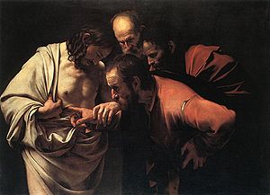
Now let’s try this famous painting by Caravaggio, also nominally “Baroque”:
Do you see the wound of Jesus? Of course you do. You see nothing else.
Which is “better”? Again, it is not a fair question, and let me answer it anyway. The Caravaggio is better. It is superb, in fact, one of the best paintings in art history. Ottobeuren is kitsch (which doesn’t prevent hordes of American tourists from visiting it).
But in the interests of fairness, I must qualify that the intent of the two artists was different:
- The purpose of Ottobeuren is to overwhelm you when you come in.
- Caravaggio’s purpose is to focus your attention on one action — with light, detail and gaze (ie, that of the disciples) all subservient to that purpose — so that you contemplate a story around that action.
What would Caravaggio have done if his patron had asked him to put, oh, a little angel or curlicue in the upper right hand corner, to “make better use of that space”? Caravaggio would have ignored him.
III. Microsoft or Apple
Let me sign off on this little meditation with the famous spoof of Microsoft “improving” Apple’s iPod packaging. As you watch and smirk, think of your Powerpoint presentation, your corporate memo, your essay, your book or whatever: Are you going to commit, with courage, to the point you want to make? Well, then cut the crap. Get Zen. Put the finger in it.


