Somewhere between Apollo & Dionysus

Apollo

Friedrich Nietzsche not only loved Greek art and culture per se but he was also, as we discussed the other day, always searching for timeless lessons from the Greeks to help us understand modernity and ourselves.

He found one such lesson in an apparent duality that ran through all of Greek art: the tension between two gods who were also two archetypes and half-brothers: Apollo and Dionysus.

Think of them as a Greek Yin and Yang.

Apollo, the god of the sun and wisdom, as well as poetry and music, would be the equivalent of the Chinese yang (ie, the bright, masculine sun).

Dionysus, the god of wine, intoxication, ecstasy, passion and instinct, would be the equivalent of the Chinese yin (ie, the dark, feminine moon).

Obviously, I am stretching that analogy, so don’t get too wound up about it. If you prefer, you can think of them in our contemporary pop-psychology terms of left brain (Apollo) and right brain (Dionysus).

Dionysus

So why should this duality be so interesting, for the Greeks or for us?

From Homer to John Wayne: The Apollonian

Nietzsche saw in these two archetypes two approaches to art, and indeed life.

Homer, for example, followed his Apollonian instinct in writing the Iliad and Odyssey in the 8th century BCE. How so? Because he glorified the war against Troy and the subsequent nostos (homecoming) of Odysseus. He made these stories beautiful, as Apollo was. He gave the Greeks and us role models.

He made the Greeks proud to be Greeks, proud to descend from whichever hero in the long catalogue of ships they traced their lineage to. He made them aware of their individuality, of the structures of society, of its fundamental order to which, after intervening episodes of wrath (see: Achilles), everything must return.

Julian Young in his biography of Nietzsche compares this to, for example, our Westerns (the ones with John Wayne more than those with Clint Eastwood). There, too, you see people dying, but they die in a stylized, Homeric way: The bullet hits and they tumble from their horses, looking good as they do so. They are our heroes, beyond the sordidness of reality.

Young gives another modern example: women’s magazines. Those are full of celebrities (our goddesses?) with their tales of disease, divorce, death and drugs. The subtext is ugly, and yet it is presented to us as glamour.

Nietzsche calls this being “superficial out of profundity.” Apollonian art does not censor facts (such as death) but perspectives. It involves a certain amount of self-deception, but it is uplifting. It deifies everything human, whether good or bad. And so it is, yes, religion.

From Sophocles to the rock concert: The Dionysian

By contrast, Aeschylus and Sophocles (but not Euripides, see below) followed their Dionysian instincts in the tragedies they created the fifth century BCE. This might have been expected: Those tragedies were, after all, performed once a year at the festival of Dionysus.

Dionysian art is about the abandonment of order, or ecstasy (ex-stasis = standing out of everyday consciousness). It transcends words or concepts. This is why it tends to involve visuals and music.

Music was in fact an important part of Sophocles’ and Aeschylus’ tragedies (we just don’t know how it sounded, what a pity!). Apparently, the audience sang along with the chorus and became one with it.

The individuals there would have become hypnotized by the sound (rather as yogis feel a certain ‘vibe’ when chanting Om with others). In fact, they would have, as one says, lost themselves in the crowd. They would have stopped feeling separate and individual, Athenian or Greek. They would have had (Freud’s) oceanic feeling.

Credit: Nambassa Trust and Peter Terry

Young compares this to our rock concerts or raves, to our football and soccer stadiums. Dionysian art is a trance and a trip, usually good, sometimes bad.

It is, in contrast to some Apollonian art, apolitical and devoid of any message. The Athenians participating in Sophocles’ tragedies stopped caring about worldly affairs. They became almost apathetic.

This was the only way they could bear to see their heroes — those same Apollonian heroes — torn down and devastated, knowing that they themselves might meet the same fate, understanding that reality was sordid, that it was primal and dark, and that it demanded to be accepted in that way. And they found a beauty in that feeling, too. So it, too, was a form of religion.

From Socrates to Princess Diana: What Nietzsche decried

Nietzsche loved both the Apollonian and the Dionysian, understanding that, like yin and yang, neither can ever be denied.

What he did not like, however, might surprise you: Socrates.

Why? Because Socrates represented, to Nietzsche, the religion of reason — not Apollonian wisdom but cold, methodical logic. In that sense, Nietzsche believed that Socrates “killed” Attic tragedy and Homeric poetry, and the playwright who represented that trend (to Nietzsche) was Euripides, the youngest of the three great tragedians.

Our own age, Nietzsche might say, is “Socratic” in the sense of scientific and myth-less, neither Apollonian nor Dionysian. Because we can’t act out these two instincts, we instead cobble together what Young calls “myth fragments”. We don’t release urges, as the Greeks did, but instead look for thrills, for sex and drugs and trips. We sky- and scuba-dive, we get a new app.

We worship neither Dionysus or Apollo but idols like Princess Diana. How appropriate, since Diana was the Roman Artemis, sister of Apollo.

Bookmark and Share

Emphasis & beauty: More … or less?

Today, two questions for you to ponder:

  1. To emphasize something (an idea, a word, an image, a sensation, anything), should you add or remove?
  2. To make something more beautiful, do you need to add or remove?

So this is a post about adding and removing.

I come at this, naturally, from the perspective of a writer. And as you might remember from my post about “color in writing,” I like to use art as an analogy for writing. Of course, I could also use sound, or smell, or touch or taste — but that is harder to do on a blog. So let’s think about words as visual stimuli.

I. Zen writing or Thai writing

Look at those two temple scenes above (both from Wikipedia). I’ve been to both temples. Both are Buddhist. One is in Kyoto, Japan, the other in Chiang Mai, Thailand. Both cities are among the most beautiful I’ve ever seen.

All of that is beside the point. If you’re like me, you will immediately focus your glance on one object: the pile of sand (or was it pebbles?) in front of the Kyoto temple. You will then scan the Thai temple for something to focus on … and give up, returning to the pile of sand.

Which style, the Zen or the Thai, is better at emphasis?

The Zen, of course. And it does that by removing details, the better to show one stunning detail.

The Thai style, by contrast, is not interested in emphasis. It is interested in sensual barrage.

So, although both are nominally Buddhist, you realize that the two styles present two separate conceptions not only of aesthetics but also of religious experience. If you are like me:

  • the Zen experience leaves you serene,
  • the Thai experience leaves you stimulated.

(Incidentally, you will generally find the same contrast between Japanese and Thai food.)

Is one “better” than the other? That’s not a fair question. But life isn’t fair, so I will answer it. The Zen aesthetic is superior.

Now, let’s say you are a designer of temples (= writer). You better know at the outset which experience you’re trying to create. If you’re trying to make people serene, you better not incorporate any “advice” from the Thai guys; if you’re trying to stimulate, don’t listen to the Japanese.

Put differently: author, know thyself.

II. “Baroque” writing or “Baroque” writing

Let’s take another example. The caricature of Baroque and Rococo art is that they are overly ornate — Thai, rather than Zen, if you will.

This abbey in Ottobeuren, Bavaria, near where I grew up, is an example:

Do you see the wound of Jesus on the ceiling?

Didn’t think so.

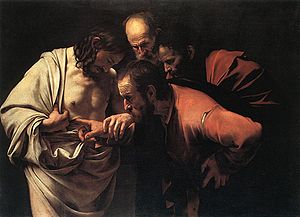
Now let’s try this famous painting by Caravaggio, also nominally “Baroque”:

Do you see the wound of Jesus? Of course you do. You see nothing else.

Which is “better”? Again, it is not a fair question, and let me answer it anyway. The Caravaggio is better. It is superb, in fact, one of the best paintings in art history. Ottobeuren is kitsch (which doesn’t prevent hordes of American tourists from visiting it).

But in the interests of fairness, I must qualify that the intent of the two artists was different:

  • The purpose of Ottobeuren is to overwhelm you when you come in.
  • Caravaggio’s purpose is to focus your attention on one action — with light, detail and gaze (ie, that of the disciples) all subservient to that purpose — so that you contemplate a story around that action.

What would Caravaggio have done if his patron had asked him to put, oh, a little angel or curlicue in the upper right hand corner, to “make better use of that space”? Caravaggio would have ignored him.

III. Microsoft or Apple

Let me sign off on this little meditation with the famous spoof of Microsoft “improving” Apple’s iPod packaging. As you watch and smirk, think of your Powerpoint presentation, your corporate memo, your essay, your book or whatever: Are you going to commit, with courage, to the point you want to make? Well, then cut the crap. Get Zen. Put the finger in it.


Bookmark and Share

Disruptive innovation (1): Cézanne

Paul_Cezanne

I ended my post on Clay Christensen’s idea of disruptive innovation in business with a promise (threat?) to try to extend the concept to other spheres of life. The purpose of this little exercise–as with almost anything on The Hannibal Blog–is to test this idea. In other words: If Christensen’s idea is profound (as opposed to banal, as many of you seem to think, based your comments) it must be extensible, so let’s see whether it is.

Attempt Number 1: Context = Art; Example = Paul Cézanne

Here is how I would write a biography of Cézanne using (in green italics) concepts from Christensen’s theory:

I) The incumbent

The incumbent during the nineteenth century, especially in France, was the mostly neoclassical art establishment. Conservative, staid, rigid, it demanded high and traditionally-defined technical mastery from artists:

  • The improvement trajectory of art was to paint/sculpt the same old subjects (Rome/Greece, Virgin Mary etc, flower vases, hunts….) in the same style but with ever more skill.
  • The intended market was that of existing art connoisseurs (gallery goers, critics, the nobility).
  • If we were to choose an institution to represent this establishment, we would pick the Paris Salon, an exhibition by the Académie des beaux-arts whose gate-keepers were a jury of art snobs.

II) The disruptor

One group of hirsute and rebellious young men finally said the obvious: that this art establishment was boring and served only the twisted standards and tastes of a small circle of snobs. They told that establishment to go to Hell and painted in a different style. The incumbent considered it less technically accomplished and either ignored or insulted it, dubbing it, derisively, impressionism.

One man, so loosely affiliated with this “group” that he did not even consider himself to be part of it, was Paul Cézanne. Cézanne was not obviously gifted at painting in a technical sense (his best friend, Émile Zola, was far better at drawing, which was all the more infuriating since Zola did not even take this talent very seriously because he wanted to be, and became, a writer instead). But Cézanne pressed on:

  • He embarked on his own improvement trajectory, beginning with incredibly simple subjects–for example, the same house in the sun of Provence, over and over again–and gradually, over the course of an entire life time, became better.
  • His market, if he thought about it all, was that of non-consumers: all those people, from his friends to ordinary folks, who did not necessarily visit the Paris Salon, or any museum, who did not care whether this artist was technically superior to that artist, who just looked at something and said Ahhhh.
  • The incumbent, seeing that Cézanne was technically inferior, ignored him. Year after year, Cézanne submitted his canvases to the Paris Salon, and year after year the jury rejected him. Cézanne instead hung his paintings in the ironically-named Salon des Refusés.
  • Over time, however, Cézanne became good enough (technically speaking), while staying original and simple, so that, his market of previous non-consumers swelled and eventually embraced the market of previous consumers, ie those who had once paid attention only to the art sanctioned by the Paris Salon but now decided that Cézanne was worth a look.
  • At this point the disruption occurs. The Paris Salon belatedly recognizes Cézanne, but hardly anybody even cares any longer. A new generation of artists now looks to Cézanne, not Neoclassicism, for inspiration. Cézanne’s rebellion and authenticity become the “new normal” and a century of permanent revolution in art begins. Pablo Picasso calls Cézanne “the father of us all”. Cubism, Expressionism, and all their descendants acknowledge their debt to Cézanne.
  • Cézanne thus becomes the incumbent, even as Picasso and others are already beginning their new round of disruption.


Bookmark and Share

More contemplation of the Bird in Space

IMG_0334

You may recall that, a while ago, I showed you Brancusi’s Bird in Space as my overture to a brief meditation on simplicity, beauty, honesty (and Einstein). Well, I couldn’t find a copyright-kosher image of the sculpture I had in mind, so I took a different version, one that was almost as good but not quite.

This, on the left, is the version I had in mind (even though the image is crap). Everything I said stands. When you strip away all extraneous detail, the underlying form of your sculpture (argument, story, living room, body, dish, …) must speak for itself. In this case it reveals its beauty. If the underlying form is ugly, well, let’s at least find out.

How did I come by this picture? Oh, I forget. Let’s just say that an elderly Filipina museum guard made herself known rather instantaneously….

Bookmark and Share

About not confusing length with depth

Height_demonstration_diagram

A brief meditation on: length in writing, which is to say word count.

As a writer I am intensely aware of word count, throughout the entire process, even while I am still conceptualizing my story idea. What would be the natural length of this idea? What new idea would I have to add, or how would I have to expand the idea, to justify more word count? Could I deliver the same idea in fewer words?

At The Economist we have a very inflexible page layout. For example:

  • A lead note, in our jargon, is the first piece in a section, and should just turn a page, but within a prescribed line count. = 1,100 words
  • A note, which is a regular piece in a section, = 600 or 700 words.
  • A column–such as Lexington (US), Charlemagne (Europe), Banyan (Asia), Bagehot (Britain), Face Value (Business), Economics Focus (Finance), or Obituary–is a few words short of 1,000.
  • A box, ie a short and quirky sidebar, = 300 or 500. And so on.

I have learned to like writing for prescribed word counts. It is great discipline.

For example: When I write Face Values, I write 990 words, then cut six words to leave my piece one line short. Why? Because that way an editor can’t take anything out without putting it back in! 😉 It’s also my way of winking at my editor, and they, tending to be cavaliers, usually get it and wink back.

Even in these sloppy blog posts, I always look at the word count, out of interest. Did you know that the average blog post, and possibly also the ideal blog post, is about 250 words? That’s just about what our boxes are at The Economist. My average is above that, but that is beside the point. The point is that….

Length matters

Take the New Yorker. My former boss, Bill Emmott, once said that its writers tend to:

confuse length with depth.

I heard Bill say this when he was leaving The Economist and giving farewell interviews, in which he was explaining what was special about The Economist. Brevity, for one thing.

Of course I know where that reaching for length on the part of writers comes from. All my students (when I taught at a Journalism School) always wanted to write long pieces. There is more kudos in it. You don’t get awards for 300-word pieces.

Well, that is a scandal. You should get awards for 300-word pieces, and even for shorter pieces. Haikus! Limericks! Sonnets!

(Editor: ‘Nice piece, William, but, you know, could you make it longer? William: ‘Er, OK. How ’bout: Shall I compare thee to a summer’s day, in the sweltering and sultry heat, just after a really, really big downpour….’)

Why do people never listen to what the great writers say? That same William in the sonnet joke, for instance, said, via Polonius (in Hamlet, II, 2), that

brevity is the soul of wit.

Or take Mark Twain, his American equivalent:

I’m sorry I didn’t have time to write you a shorter letter.

Or take Ed Carr, one of my editors, who once, 10 years ago, told me to

crucify your darlings,

by which he meant that I should write and then find the phrases in my writing that I was most proud of (!) and just … cut them! For the heck of it. To prove to myself that I can. To stay humble and nimble. That phrase was my screen saver for three years.

Seeing negative shape

250px-Michelangelos_David

Well cut

The skill in all the arts is to take away stuff, not to add stuff. When they asked Michelangelo once how he made such beautiful figures out of stupid blocks of marble, he said something like:

Easy. I visualize the figure inside, then I cut away the rest.

A lot of art goes wrong because the artist does not dare to do that. This is when a great and riveting Hollywood movie suddenly becomes unbearable — because instead of ending when it should, it goes on for another twenty minutes of moral summary and closure (in a courtroom, probably) just in case you didn’t get it.

Cutting into flesh

Michelangelo only cut marble fat, not marble flesh, of course. Over-cutting is just as bad as over-writing. This has also  happened to me.

Sometimes, I write something that demands space and expansion, but then news happens and our layout changes at the last minute and an editor has to cut my piece to fit. This can go wrong. Perhaps the piece was subtly humorous or ironic, and now the tiny signals and implied winks are missing and it falls flat. Or a logical connector gets cut and the piece seems like a non sequitur. Or something went from being simplified to oversimplified and is just plain wrong.

Or a writer might simply have a great subject that, by nature, wants to go on and be told as a story but instead dies a premature death.

But I’ve observed that writers overwhelmingly err to one side: they overwrite; they rarely overcut. And they suffer more when an editor cuts than when an editor asks for more. Even though, to improve, they should always consider both options, simultaneously.

All of this is simply to say: Every story, every thought, every joke, every movie, every poem has a natural (=optimal) length. A lot of good writing is simply intuiting that length and then writing to it, and not one word more or less. Unless you want to wink at your editor and leave it one line short.

“Color” in writing

445px-der_mann_mit_dem_goldhelm

I think this is probably my favorite Rembrandt. More than that: it is a lesson! What makes this painting so good is the same thing that makes good writing good. It is the sparing use of color and light.

For two years, I taught at Berkeley’s journalism school (thanks to Orville Schell, the then-dean, who invited me). That was the first time that I had to think about (ie, analyze, intellectualize, verbalize) writing, as opposed to just doing it for a living. And one thing that struck me is that all my students, and quite a few of the teachers there, grotesquely overdid that thing writers call “color”.

Before I go any further, so that we are on the same page, let me give you a caricature of what I mean (this is made up! No real writers are being harmed or embarrassed!):

On a bright, sunny day, John Smith was striding into his corner office, with a view of the Hudson and pictures of his three sons (Jimmy, 12, Billy, 14, and Bobby, 18) on his desk, next to a pile of Wall Street Journals and a cup of Starbucks soy latte. “I love this view,” said Smith. The Fortune 500 executive then turned…..

How many New Yorker articles have you read that started with some variation of ‘On a recent Sunday afternoon…’ or “It was a dark, overcast day when John….”, only to discover on the third of the article’s fifteen pages that these details would almost certainly prove to be of no help whatsoever?

So there I was at the J-School, getting paid to read piece after piece by bright-eyed young journalism students who were so eager to prove that they had been there (wherever there happened to be), that they had actually interviewed some guy, that they had got the color, that they were ready for the New Yorker. It got extremely tedious.

Color and substance

Am I against colorful writing? You must be mad. Of course not. I love color. By the standards of The Economist, I am a “color” guy. No child has ever said to his parents, ‘mommy, I want to grow up and write really monochrome stories’. If you have ever felt the impulse to try your luck as a writer, it was because you loved color, whether or not you called it that yet.

The problem is that color without substance is just a paint bucket that tipped over. I’m not even talking about Rembrandt versus, say, Jackson Pollock. I’m talking about Pollock’s studio floor before he cleaned it up.

Color has to be in support of something. And that something has to be an idea, a thought, a story. The mistake many writers make is to list details. Lists are boring; we use them to go shopping. Details are boring, unless they illuminate some meaning. It does not have to be epic. It can be quirky, amusing, moving, insightful, whatever. But there has to be a there there.

So the trick is to find substance, and then to take away details so that only a few splashes of light and color remain, which then filter out the entire sensual world around the reader and deliver him to that one place that you, the writer, have in mind for him. In terms of thought process, it may be the opposite of what my students were doing, and what I used to do.

I can find no better illustration than Rembrandt, above. You are drawn deep into this man. If I asked you, you would say that there is so much color in this painting, so much light. Only then would you notice that most of the canvas is dark, that very little of it is … in color.

Bookmark and Share

Backdrop to the story: Hellenism

737px-dying_gaul

I’ve always been a fan of Hellenistic art, such as this sculpture of a Dying Gaul (a Roman copy of the original Greek sculpture, made during Hannibal’s lifetime). Compare the Gaul above to the sculpture below, which shows either Poseidon or Zeus and was made about two centuries earlier, during the Classical era.

469px-netuno19b

Huge difference, wouldn’t you say?

In the Classical era, art (which, as we all know, imitates life) was about depicting heroism in a stylized, idealized and static way. Even if the god is about to throw a thunderbolt, he seems frozen in time. He does not look like an individual but like a type.

In the Hellenistic era, by contrast, art is about individualized, internal, psychological and much more complex depictions of heroism. The Gaul looks ethnically like a Celt; he is struggling against death with as much turmoil on the inside as on the outside; he looks like he is actually moving on his shield. This is one man, unique, during the moment of his life’s ultimate drama.

Why am I talking about this?

Because the Dying Gaul is a great visual clue about the historical era in which the plot of the main characters in my forthcoming book unfolds. (As always, please remember that the plot and the characters are just the frame for a story that is about us today, about success and failure in our lives!) Hannibal and Scipio encountered each other during this, the Hellenistic, era.

In a coming post, let me try to begin to unravel the mystery I set up in recent posts: namely, how was it possible that Rome, an obscure Italian town that most people had never heard of, came to replace (and erase) Carthage, the Mediterranean superpower, making our own world forever Roman? Understanding these events starts, ironically, with understanding Hellenism, ie the Greeks.

Bookmark and Share

Brancusi, Einstein, simplicity and beauty

If non-conformity and “impudence” are the first ingredients in the astonishing creativity of a man such as Einstein, as I said here, are there yet other ingredients? Of course. And the most important, in my opinion, is an appreciation of simplicity.

More than most people I know, I yearn for simplicity in my life–on my desk, in my file folders, in my home decoration, in my writing, my sentences and of course my thoughts. Quite probably, that is because there is far too much complexity in all of these.

When I approach a new topic, as I did a years ago when I, who was a technophobe, took over the tech beat at The Economist, I first run it through my complexity/simplicity filter. At that time I came up with this.

If I had to choose a favorite sculptor, it might be Brancusi, who grasped simplicity as well as anybody. It is at heart an uncluttering. In Brancusi’s case, he strips a thing of all unnecessary detail in order to reveal its underlying form.

Simplicity is thus also a form of honesty. Once the underlying form of a thing is revealed, you know whether it has beauty or, in the case of writing, also substance. Some of you may recall my idiosyncratic way of reading, by copying and pasting a long document into my word processor, then deleting all extraneous detail as I go along. In effect, I force simplicity onto, say, a research paper. Often, this is how I realize that the boffin in question was a windbag and had nothing to say, hiding behind verbose complexity. Other times, I realize I have hit a treasure trove.

Back to Einstein. Isaac Newton in his Principia had already said that

Nature is pleased with simplicity.

Einstein extended his hunch, saying that

Nature is the realization of the simplest conceivable mathematical ideas.

and

I have been guided not be the pressure from behind of experimental facts, but by the attraction in front from mathematical simplicity.

What goes for sculptors, inventors, physicists and other forms of homo sapiens goes especially for writers.

The suffering of Frida Kahlo

Frida Kahlo and Diego Rivera. Photograph by Carl Van Vechten at Wikimedia Commons

Kahlo and Rivera. Photo by Carl Van Vechten, via Wikimedia Commons

I popped into the Frida Kahlo exhibition currently at the San Francisco MOMA. Mainly, to see her piercing paintings–and boy, do they pierce–but also, at least in part, as research for my book.

A friend of ours, Erika Lessey Chen, had suggested Kahlo to me a year ago as a possible life-story to look into. I had told Erika that I’m interested in people whose success (triumph) somehow turned into failure (disaster), or whose failure somehow turned into success, à la Kipling’s impostors.

Does Kahlo fit my story-line? Mostly, I’m looking at characters such as Hannibal’s enemy and nemesis Scipio to illustrate how disaster at the right moment in a life can liberate a person–set free his or her imagination and creativity, and thus initiate a much bigger triumph in the future. People such as J.K. Rowling and Steve Jobs.

But disaster can have other effects, of course. There is the strength that comes from overcoming it. I’ve mentioned Joe Biden and Demosthenes in that context. Among the main characters in my book, the person who would personify that is Fabius, the old Roman senator who was the only one not to despair after Hannibal’s crushing victories.

And Kahlo? As I walked through the exhibition and looked at her absolutely harrowing self-portraits, I realized that she had done something else again with her own disasters: She had made the disasters themselves the success.

Here she was on a hospital bed in Detroit, her body writhing and bleeding, with a uterus and a fetus torn out of her. She painted it after yet another miscarriage. The people in the exhibition became very quiet in front of that one.

There she was bound in a steel corset with a broken spinal column, her entire body pierced with nails. In this painting, she is all pain and frustrated sexual desire.

Over there she is sitting in a double-self-portrait, after her marriage to Diego Rivera had failed. She is holding hands with herself, and simultaneously tries and fails to stop the bleeding of her heart. (All these paintings seem to be copyrighted, so I don’t want to show them here.)

What were her disasters? The first was polio, which she caught at age six, and which left her right leg atrophied. The second was a bus accident when she was eighteen. She broke her spine, her pelvis, and lots of other bones, and an iron handrail pierced her uterus, leaving her infertile. The third, arguably, was falling in love with Diego Rivera, whom she adored but who was never faithful to her.

In short: pain, infertility, loneliness. And to deal with it, she painted. And the painting made her into the most “successful” Mexican artist ever.


Bookmark and Share