Either odd to us or to them and we opt for them

As most of you know by now, I am an admirer of British irony and wit, the subtler instances of which I occasionally highlight or dissect, as here, here, and here. At its best, it is a matter of tone, not a matter of telling jokes. And it is best delivered casually.

Today happens to be our weekly deadline day at The Economist, and I am right now (thanks to the London time zone that I am forced to observe in California) finalizing my piece in the next issue with one of our editors, Ann Wroe, who happens to be one of my favorites (and who is a successful book author in her own right).

In the piece, I quoted an American think tank whose name starts (as they all seem to do) with “Center For The…”

Ann changed it to “Centre For The…”. I asked: Do we change words to British spelling even when they are names?

And she replied:

Yes, words are anglicised even within proper names; it either has to look odd to us or odd to them, and we opt for them.


Bookmark and Share

Observation, satire or snark?

Cintra Wilson

Cintra Wilson

Snooty, bitchy and arrogant? Or edgy, witty and incisive? In short, bad writing or good? That is the question.

That’s Cintra Wilson in the little mug shot above, and I would have absolutely no interest in, or knowledge of, her if she had not just re-inflamed some old kindling for all writers. Do not mistake this post as being about the content of the text I am about to refer to–I neither know nor care about fashion. In this post I care only about the issue of writer’s voice.

Background:

Cintra wrote a review in the New York Times of a J.C. Penney store that has opened in Manhattan. The review was, shall we say, scathing. Penney, she said, is a

dowdy Middle American entity

that, in essence, has no right to be on this island of skinny snobs. The clothing is full of polyester, the racks are full of sizes 10, 12 and 16, but not Cintra’s 2; and, perhaps most damningly, the store

has the most obese mannequins I have ever seen. They probably need special insulin-based epoxy injections just to make their limbs stay on.

Reaction:

Perhaps predictably, the country appears to have gone to war against Cintra. Bloggers are attacking her, for example herehere and here. Tenor: Cintra is an asshole; go shop at J.C. Penney just to spite her!

The New York Times, meanwhile, appears to have been receiving bags (gigabytes) of hate mail, decrying the newspaper’s

fat hatred, class bias and nasty humor.

The journalist, her editors, and the entire damn publication must be “smug”.

In response, Clark Hoyt, the Times‘ “public editor” or ombudsman (a bizarre and navel-gazing role, by the way) pens a characteristic mea culpa, oozing sudden humility on the newspaper’s behalf.

He does a great and succinct job of summarizing the eternal and underlying tension that is relevant for all writers when he asks:

What is the difference between edgy and objectionable? Or, as one reader … put it: How do writers “navigate the fine lines between observation, satire and snark.”

He even prompts the newspaper’s executive editor, Bill Keller, to say that

he wished it had not been published.

Wow. Cintra must be up there with Judith Miller and all those articles in the run-up to the Iraq War if she deserves editorial disavowal.

Cintra, meanwhile, has apologized on her blog and is back-peddling.

Exegesis:

So let’s contemplate Clark Hoyt’s question: How do we navigate that fine line?

Allow me to remind you that the publication that I happen to write for, The Economist, is accused of smugness on an hourly basis. And every time somebody calls us smug, somebody else is simultaneously calling us “refreshing” or “incisive” or something even more flattering.

Furthermore, I am right now trying to figure out just what my appropriate voice is in the book that I am writing.

So, just a few observations:

  1. Navigating that fine line is just one of the things that makes good writing so incredibly hard. Because yes, it really is hard, otherwise a lot more people would be doing it. So remember that, readers, when you write your angry (snarky!) hate mail to us journalists.
  2. Would you really–I mean really–prefer to shut up the Cintras out there, to sanitize them, to edit in the “on one hands” and “on the other hands”, to give 50% of the article to those who say that Iraq did have WMD and 50% to those who say it did not, because, you know, 50-50 is “balanced” and 10-90 might offend the heartland? You get my drift.
  3. Or would you prefer an authentic, damn-the-torpedoes, honest voice, one that tells it as its owner sees it and is prepared to explode with the torpedoes?
  4. Bill Keller: If you really do wish that Cintra’s piece had not been published, why did you not, as editor, nix it? Since you did not nix it, what the f*** are you doing now disavowing your writer?
  5. There is an easy way to address the reaction to pieces such as Cintra’s: Publish more pieces by other writers with an equally authentic but different voice. This would indeed be edifying for your readers. But do not dilute the copy that comes across your desk into the lukewarm bilge that would, at last, be the end of good writing.


Bookmark and Share

Writing better dialogue

Good at dialogue

Good between the lines

I don’t normally write dialogue in my day job at The Economist. Nor is dialogue a major part of my forthcoming book. But it is a small part of it, which is to say that I’ve inserted precisely one single dialogue between Hannibal and someone else that is not actually in the ancient sources (ie: Livy, Polybius, Cornelius Nepos, Appian, etc). This was necessary, as you guys will eventually see when I start blogging parts of the book.

The discovery that I made as a writer is that dialogue is

  1. very different from other prose, and
  2. difficult to do well, really well.

It should sound the way an actual conversation would sound, between real people, and between the specific people in their specific context in that particular dialogue. Not corny but meaningful, not overpolished but not sloppy.

In my first draft, the particular dialogue I am talking about was one of the weaker parts of the chapter it appears in. And that’s OK. I knew it at the time.

In this second draft that I am working on right now, I think I finally hit the sweet spot.

How? It helped that I practiced.

I wasn’t even aware that I was practicing when I wrote down–essentially transcribed–the conversation I had that night in a taxi cab when things went a bit wrong.

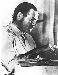
But then Cheri said in the comments that the dialogue reminded her of Hemingway’s A Clean Well-lighted Place. That was charitable of her, and it is not necessary to take her compliment too literally. But it did make me go and read that dialogue by Hemingway, and to my delight I think I understood what Cheri meant: There was a certain sparse, masculine, between-the-lines, staccato tone to the whole thing. It sounded the way a real dialogue between men sounds. Dialogues between women are very different.

And so I was able to transfer, not the content, but the tone of that dialogue into my second draft. It works. And so this is yet another way in which my dabbling in blogging has helped my craft as a writer.

Bookmark and Share

Richard Meier’s modern Acropolis

IMG_6005IMG_6006

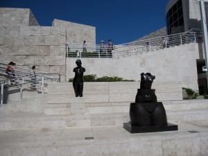
Did Richard Meier, the architect of the Getty Center in Los Angeles, explicitly intend to build a modern acropolis?

I’m almost sure that he did. This is the effect his superb architecture has. The museum’s contents–ie the art inside–is fine. But what makes the Getty Center a destination is that it is, well, what the acropolis of Athens would have been for Socrates: a space for civilized humanity. It has great Feng Shui.

Instead of sitting on a hill, the Getty Center, like the acropolis, seems to rise out of, or to be, the hilltop. It blends into its topography and simultaneously defines it. It signals itself to the people below as the obvious place to go up to. To the people already inside, it is a natural, light-filled place to dwell. It keeps you in, makes you reflective and social, encourages you to meander and talk.

It is simple and yet subtle, the equivalent of a Brancusi sculpture or of the kind of writing I like.

The easiest way to know that it is good architecture (= the way to know good writing) is that it does not make you tired. You can walk through the Louvre, for example, and feel all dutiful about being cultured, but within minutes you want to yawn, sit, sleep, escape, open a window. The Getty Center, and all good art in any medium, makes no such demand on you. It says “check your sense of duty at the door and come in: the culture will happen all by itself; you will feel refreshed after.”

Bookmark and Share

Stuff and clutter on web pages

Mostly, in this thread on stuff and clutter, I’m talking about actual, tangible stuff, stuff you can throw out or hit your toe against. But stuff can be non-material too, cluttering up our brains or … web pages. Mark Hurst is a usability thinker, and has this anecdote from a recent consulting trip to a company–let’s call it Acme–with a snazzy web site:

…Anyway. Acme had a problem: research showed that their website was completely, unforgivably, disastrously hard to use for their customers. And *ugly*, on top of that, as if it was spat from a template circa 1996. So I sat down with the executives, everyone with a stake in the online presence, to help them improve the business metrics by improving their website.

Here’s an excerpt of the meeting transcript, more or less.

Me: One thing customers complained about was the home page navigation. To quote one customer we talked to, “I can’t figure this thing out and I’m leaving right now.” I think it had something to do with the flaming chainsaw animation that follows the mouse pointer around the screen. Is it possible we could remove that?

VP Marketing: Oh right, the flaming chainsaw animation. I’d love to take that off the site, really I would, but I just think it’s so neat, and besides it aligns with our brand message of innovation here at Acme.

Me: But customers would shop more, and buy more, if it wasn’t there. Wouldn’t you like to reconsider that animation?

VP Marketing: Here in Marketing we have to adhere to our brand guidelines, and innovation is central to that, so I’m afraid the animation has to stay.

Me: OK – next up is the customer complaint about the 18-level-deep flying dynamic navigation sub-menus. Several customers said all the menus zipping around the screen made them dizzy.

VP Technology: I know what you’re referring to. That menu system took our technology team six months to code up, and I have to say it’s the most advanced implementation I’ve ever seen, really an awesome job.

Me: The technology is impressive, for sure… I mean, I’ve never seen 18 nested levels all flying in unison like that.

VP Technology: Thanks, man.

Me: Uhh – sure thing. But I’d just like to push back a little on this – the customers did say that the menus were confusing. How about a simpler menu, maybe just a few links to the top-level categories, and that’s it?

VP Technology: Listen, I’m all for simplicity and ease-of-use and all that, I hear you. I really get it. But I have to tell you, Web technology is moving fast, and if we don’t keep up, we’re going to look like Google or something. A bunch of blue links. Borrring.

Me: Allllright. Now we’ve covered the flaming chainsaw and the flying menus, let’s move on to the logo graphic. Some customers complained that they didn’t want to scroll down a full page just to get past the logo, the large stock photos, and the slogan.

VP Branding: What did they say about the color scheme? I’m just wondering, because the green and fuscia palette is really supposed to, you know, bring forth assocations of innovation and holistic thinking, all while blending in with the flames from the chainsaw.

Me: I think I have a plane to catch. (Exit conference door right)

Bookmark and Share

More contemplation of the Bird in Space

IMG_0334

You may recall that, a while ago, I showed you Brancusi’s Bird in Space as my overture to a brief meditation on simplicity, beauty, honesty (and Einstein). Well, I couldn’t find a copyright-kosher image of the sculpture I had in mind, so I took a different version, one that was almost as good but not quite.

This, on the left, is the version I had in mind (even though the image is crap). Everything I said stands. When you strip away all extraneous detail, the underlying form of your sculpture (argument, story, living room, body, dish, …) must speak for itself. In this case it reveals its beauty. If the underlying form is ugly, well, let’s at least find out.

How did I come by this picture? Oh, I forget. Let’s just say that an elderly Filipina museum guard made herself known rather instantaneously….

Bookmark and Share

Writers, lose your notebooks

notebook

No, I don’t mean that all of you should literally throw them away right now. In fact, I keep all of my notebooks, going back years, officially for libel-defense purposes but really out of superstition. But that’s not what this post is about. It’s really about the following anecdote.

I happen to live next door to Michael Lewis, an author of several bestsellers (Liar’s Poker, Moneyball, The Blind Side, et cetera). He and I were walking down the hill once to get some lunch. We got to talking about the time that he came back from a big reporting trip for a book, only to discover …. that his notebook was gone!

“And it turned out….”, I began asking.

“Oh, much, much better,” he said.

And we both cracked up.

When my notebook lost me

Here is a brief description of my early years as a journalist, which is the experience that made me laugh at (ie, understand) Michael’s response.

When I started, I was so enthusiastic about observing every last detail and capturing every quote by everybody I met that I agonized over my note-taking. I could not write fast enough. In the evenings, I took a night course in shorthand (Teeline). I was the only guy; all the others seemed to be young ladies training to be secretaries (somebody should have told them that this wouldn’t prove so useful in their careers). But even that didn’t help. I never got fast enough.

So I had the quintessential writer’s predicament: Do you live, absorb, participate, think, see, hear, smell, act? Or do you stop life, and write it all down?

Recording interviews, with one of those little gadgets, didn’t help either. I didn’t like fiddling with them, and they usually intruded into the conversation, pointing at my interviewee like a dart that might be poisonous. Those things distracted me, and I threw them away.

Even so, I did capture quite a lot. I observe well, and I get “good quote” out of people. So, for a while, I was writing my articles quote to quote, detail to detail. Today, I believe that was the worst writing I have ever done.

At least close it

Around that time I heard John Micklethwait give somebody advice. The lady was having writer’s block, and John, the quintessential British cavalier, said, roughly:

“First, close your notebook. Then trust that it will come.”

(These days, John is The Economist‘s editor-in-chief–ie, my boss–so the trick must have worked for him. ;))

Relax and trust

Writing, and all storytelling, is necessarily a two-step process: 1) You live. 2) You pause, re-live and tell. You can’t merge the two artificially by writing everything down as it happens. If you try, you only interfere with Part 1).

Instead, good writers know how to relax. Only when the brain is relaxed does it make the lateral connections, the quirky associations that we call creativity. And only when you are relaxed can your interview partners relax as well.

Good writers then trust. They trust that ‘it’ comes back to them. And ‘it’ does. What is ‘it’? It is whatever comes back!

By the time it comes back, it is like water that has percolated through sediment and become pure and clean and potable. A writer’s memory is therefore like a filter, provided the writer lets it be that. What it filters is the entire overwhelming world of detail, so that only a few–the right ones–run onto the screen and become life-giving, texture-giving color.

Bookmark and Share

“Color” in writing

445px-der_mann_mit_dem_goldhelm

I think this is probably my favorite Rembrandt. More than that: it is a lesson! What makes this painting so good is the same thing that makes good writing good. It is the sparing use of color and light.

For two years, I taught at Berkeley’s journalism school (thanks to Orville Schell, the then-dean, who invited me). That was the first time that I had to think about (ie, analyze, intellectualize, verbalize) writing, as opposed to just doing it for a living. And one thing that struck me is that all my students, and quite a few of the teachers there, grotesquely overdid that thing writers call “color”.

Before I go any further, so that we are on the same page, let me give you a caricature of what I mean (this is made up! No real writers are being harmed or embarrassed!):

On a bright, sunny day, John Smith was striding into his corner office, with a view of the Hudson and pictures of his three sons (Jimmy, 12, Billy, 14, and Bobby, 18) on his desk, next to a pile of Wall Street Journals and a cup of Starbucks soy latte. “I love this view,” said Smith. The Fortune 500 executive then turned…..

How many New Yorker articles have you read that started with some variation of ‘On a recent Sunday afternoon…’ or “It was a dark, overcast day when John….”, only to discover on the third of the article’s fifteen pages that these details would almost certainly prove to be of no help whatsoever?

So there I was at the J-School, getting paid to read piece after piece by bright-eyed young journalism students who were so eager to prove that they had been there (wherever there happened to be), that they had actually interviewed some guy, that they had got the color, that they were ready for the New Yorker. It got extremely tedious.

Color and substance

Am I against colorful writing? You must be mad. Of course not. I love color. By the standards of The Economist, I am a “color” guy. No child has ever said to his parents, ‘mommy, I want to grow up and write really monochrome stories’. If you have ever felt the impulse to try your luck as a writer, it was because you loved color, whether or not you called it that yet.

The problem is that color without substance is just a paint bucket that tipped over. I’m not even talking about Rembrandt versus, say, Jackson Pollock. I’m talking about Pollock’s studio floor before he cleaned it up.

Color has to be in support of something. And that something has to be an idea, a thought, a story. The mistake many writers make is to list details. Lists are boring; we use them to go shopping. Details are boring, unless they illuminate some meaning. It does not have to be epic. It can be quirky, amusing, moving, insightful, whatever. But there has to be a there there.

So the trick is to find substance, and then to take away details so that only a few splashes of light and color remain, which then filter out the entire sensual world around the reader and deliver him to that one place that you, the writer, have in mind for him. In terms of thought process, it may be the opposite of what my students were doing, and what I used to do.

I can find no better illustration than Rembrandt, above. You are drawn deep into this man. If I asked you, you would say that there is so much color in this painting, so much light. Only then would you notice that most of the canvas is dark, that very little of it is … in color.

Bookmark and Share

The trouble with puns

Fantastic essay on puns and their utter, puerile non-necessity, by Joseph Tartakovsky.

I’ve said before that sarcasm is the lowest form of humor. Tartakovsky makes a strong case that punning should get that honor.

In a nutshell:

Puns are the feeblest species of humor because they are ephemeral: whatever comic force they possess never outlasts the split second it takes to resolve the semantic confusion. … They are the scourge of dinner tables and the despised prolongers of office meetings, some letting fly as instinctively as dogs bark and frogs croak, no longer concerned even with drawing applause; they simply can’t help themselves… [Consider] the similitude between puns and fruit flies, both of which die practically the instant they are born, but not before breeding others.

Nonetheless, I found myself pondering the boundary between punning, which I am willing to disdain, and wit, which I esteem. Take, for instance, this exchange between Voltaire and Frederick the Great. Witty, for sure. Punning? Possibly.

Even Tartakovsky includes among his examples one that I’m glad posterity has preserved:

Jean Harlow, the platinum-blond star of the 1930s, on being introduced to Lady Margot Asquith, mispronounced her given name to rhyme with “rot.” “My dear, the ‘t’ is silent,” said Asquith, “as in Harlow.”

Bookmark and Share

The two ways of being shocked

In the previous post I described two types (possibly archetypes) of people: Roundheads and Cavaliers. This post will only make sense if you read that previous one.

At the end, I invited you to guess which kind you are. Well, let me help you along a little bit.

Part I: Know one when you see one

Below is a famous clip from a famous movie. As writing has voice, so does film-making, and the voice in this clip is …. [you fill it in: either Roundhead or Cavalier]:

Now contrast that with this clip. Again, please fill in: The voice in in this clip is […]

Part II: Vote

[UPDATE: For an explanation of the poll below, see my comment.]


Bookmark and Share